Stitch Fix: Thread Renovation Overview
At Stitch Fix one of my primary responsibilities was to manage the design and content of the Client Experience (CX) Team’s intranet, known as The Thread. When I identified a need to improve the navigation and experience of The Thread I proposed and managed a redesign project. Over the course of a year I lead a small team to conduct UX research, test prototypes, and update visual elements. Within three months after launching we were able to show through analytics and team surveys that our new design had improved CX Agent efficiency by an average of 2 mins per page and increased satisfaction with the tool.
Stitch Fix
Project Lead and UX Designer
Google Suite, Figma, Miro, Asana
18 months
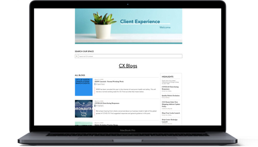
Who is the Client Experience Team?
The Client Experience Team at Stitch Fix helps clients resolve issues over email, phone and chat channels. The team values white-glove level service but also holds themselves to business-savvy efficiency and quality standards. Training to become a Client Experience Agent takes 8 weeks and they are expected to be able to handle around 100 different system interactions in their client management tools.

NEW AGENT PERSONA
Challenged by the amount of information he needs to know. Concerned that the time it takes him to find information hurts his ability to reach efficiency goals.

TENURED AGENT PERSONA
Challenged by frequent changes to workflows. Needs easy access to up to date information when helping clients on the phone.

LEADERSHIP & PARTNERS PERSONA
Needs to understand company policies and principles on what resolutions they offer clients. Challenged to support her team while still learning about the company herself.
Uncovering the problem
Observed Agents performing tasks in The Thread to understand how they’re using the tool.
Followed side by sides with discussions with Agents on what’s working about their knowledge resources, and what’s not working.
Results
My team gathered our user data into Miro and organized our findings into an activity timeline, user attributes and general feedback on the current intranet tool. From here, we identified CX Agent needs and the design solutions we could explore to improve the tool to better meet those needs.
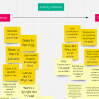
Agent resource challenges:
- Frustrated with search.
- Productivity is negatively impacted by the amount of information.
- Not confident in the quality of information.
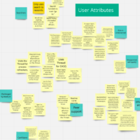
Agent resource needs
- Find information easily using search.
- Efficiently uncover relevant information.
- Clarity of information.

Possible design solutions
- Improve navigation by re-thinking the homepage experience.
- Redesign the article template to make information easier to find on a page.
- Create shorter articles to improve search.
Design and content strategy work together in The Thread. We had to consider both how things looked and how content creators would approach articles.
Prototype testing
To test our design and content strategy ideas I built 3 high fidelity prototypes in a hidden section of The Thread. We then had users representing our different personas try them out and share their feedback.
Observed Agents researching hypothetical scenarios in the three prototypes.
Followed side by sides with group discussions about which features/methodologies were helpful and which weren’t.
Get building!
The results of prototype testing disproved some of our assumptions but also showed where we were on the right track. After scoping a build plan and getting director level approval on the deliverables, we were ready to spend Q3 of fiscal year 2020 making the vision a reality. The design changes rolled out in 2 phases.

Phase 1: New homepage and navigation
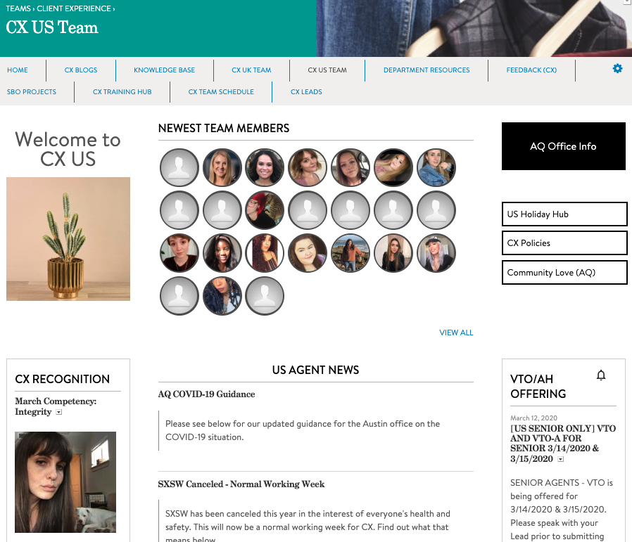
When we originally launched The Thread we’d leaned into the idea of a “personalized homepage” with a variety of options for team members to customize their experience. Through our research, we discovered that most CX Agents were unaware and uninterested in these options and went straight to the search bar or to browse knowledge articles. For the redesigned homepage we worked to simplify the homepage and prioritize these common workflows.
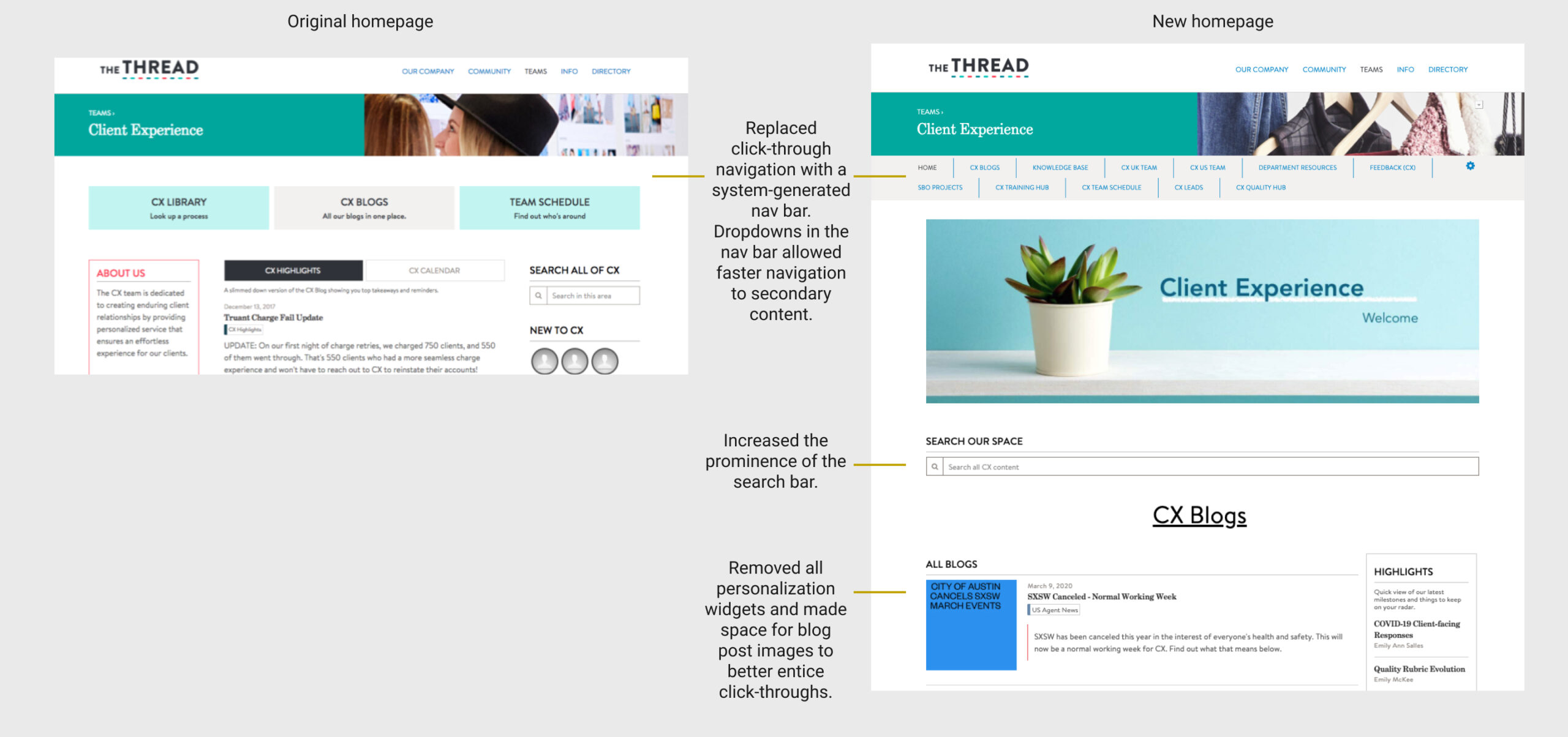
Because the new CX homepage prioritized simplicity, there was some additional content that now needed a home. Since launching The Thread, Stitch Fix had grown to add a UK business. We added new location-based landing pages to feature the engagement and team content that no longer fit on the homepage.
Phase 2: Updated content strategy

The issue
Our original content strategy in The Thread was based on a training deck from 2014. In this strategy there was the concept of a “process” that Agents would follow from end to end. This lead to repeated content and excruciatingly long articles.

Our solution
In our new content strategy we re-conceptualized content as either a “workflow” or a “client issue.” “Workflow” content were common steps Agents would follow that most tenured Agents would have memorized. “Client issues” included when to apply those workflows and issue specific details. By linking to the “Workflow” articles from “Client Issues” we were able to simplify articles for easier visual scanning, while still making sure new Agents had access to basic step-by-step information. We further shortened articles by creating the guideline “one issue per article” whereas previously issues were sometimes grouped together in an article when they had similar processes. The shorter, more specific articles would also make it easier to find specific content since the titles could better target the relevant search terms.

Renovating articles
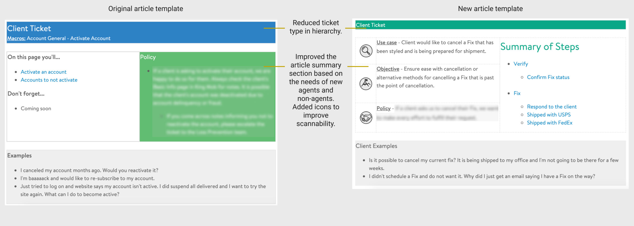
The new content strategy also meant that we needed to re-think our article template. Through iteration and feedback from stakeholders and UX team members I designed new templates for the new article types. The new templates prioritized the “above the fold” space to give readers a quick understanding of the client issue, the company policy, and the goal of Client Experience in the scenario. This grounding helps both new agents and our non-agent persona navigate the vast amount of information available to them.
To test the new content strategy we used analytics and a team survey to prioritize 11 process articles for renovation. My team and I re-wrote these articles with feedback partnership from the Training and Quality Analytics teams. After re-writing, these 11 process articles had transformed into 30, easily digestible, client issue articles and made live to the team.
Changes above the fold to improve article efficiency.
Results
After the new homepage and articles were live for 3 months we followed up to measure the impact of the project. We used data from Google Analytics, the Quality Team’s analytics and a team survey to look into the three success metrics we’d set at the beginning of the project.
Did no harm
Generally Agent quality scores rose following the Thread Renovation launch. However, due to the variety of factors at play we can’t credit The Thread with that trend.
Measurable improvement
The Thread Renovation reduced the time Agents spent on the re-written articles by an average of 2 minutes. This was a huge win!
Trending up
Our follow-up survey showed a slight improvement in agent sentiment about their resources. Satisfaction increased from a 4.2 to a 4.5 on a 7 point scale. We took this as a win, but due to the small sample size, are cautious about making big claims.
Finish what we started
Overall the Thread Renovation was considered a success and we were cleared to continue updating articles to match the new content strategy and article templates. This continued work would be part of a formal governance plan launching in 2021.
