Kindle Book Club Overview
By following a jobs to be done framework my team and I created an extension of the Kindle App experience for reading groups. This case study explores the question of how Kindle can become the preferred method of not only reading, but sharing a reading experience with a group. During user research we identified that book club members are most interested in reading support and better ways to plan their meetings. The Kindle Book Club app features that we designed focus on fulfilling those needs in a way that feels seamless with the existing app.
General Assembly
UX research & design
Sam Swenson, Kaltuma Sharif-Mohamed
2021
What would a book club hire an app to do?
Our team hosted a series of user interviews with current book or article club members to learn about their experiences, motivations and needs. We also wanted to understand how COVID-19 safety measures affected their group’s planning and meetings.

User interview findings
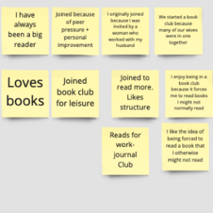
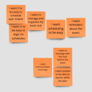
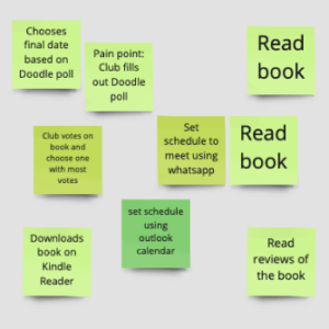
We gathered our user data into Miro and used “I want” statements, an activity timeline and user attributes to synthesize our findings. We then used our findings on book club member motivations, challenges and needs to create personas to guide our designs.
Motivations
- Want to read more
- Socialize and have fun
Challenges
- Communication
- Book ideas
- Scheduling
- Keeping up with reading
- Social distancing
Needs
- See book details and reviews
- Talk with club members
- Coordinate schedules
- Structure and support

PERSONA 1
Ruby is an enthusiastic reader who is in a club with some of her close friends. Her club needs help picking new books to read and an easy way to communicate.

PERSONA 2
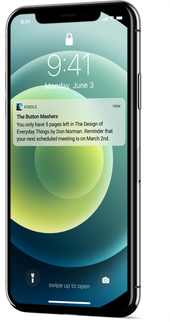
Rick is a busy professional who struggles to find the time to read. He joined a book club to get structure and support. He needs reading reminders and an easy way to see his club’s schedule.
Feature analysis
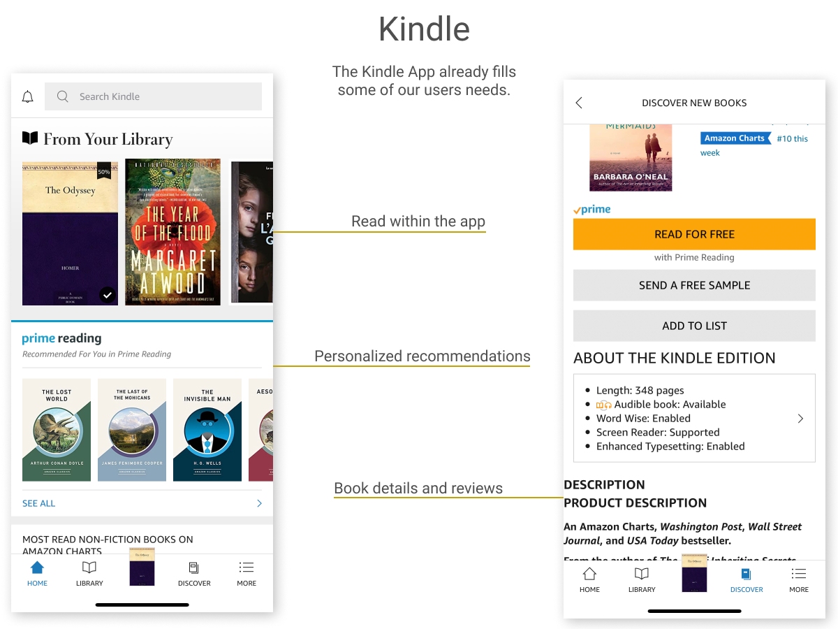
Armed with the users and use cases we wanted to solve for, we explored how these actions would fit together within an app. We became familiar with the existing Kindle App features, peeked at their competitors and sought design inspiration from best in class examples.

Creating the Kindle Book Club App experience
Now that we knew which features would bring the communal reading experience to life in the Kindle App, we began to iterate on how they would appear. We used task flows, a connecting user flow, journey mapping and hand drawn sketches to start laying out the experience for our personas.
Persona 1 task flow: “Ruby the avid reader”
Ruby wants to find book recommendations for her club’s next meeting and get feedback on her choices.

Persona 2 task flow: “Rick the reluctant reader”
Rick wants to get reading reminders about his club’s book and get social support on his reading goals.

User journey map

Sketches and wireframes

Final deliverables
To create trust in the new book club experience, we wanted to make sure our final design fit seamlessly with the existing Kindle App branding and interface.
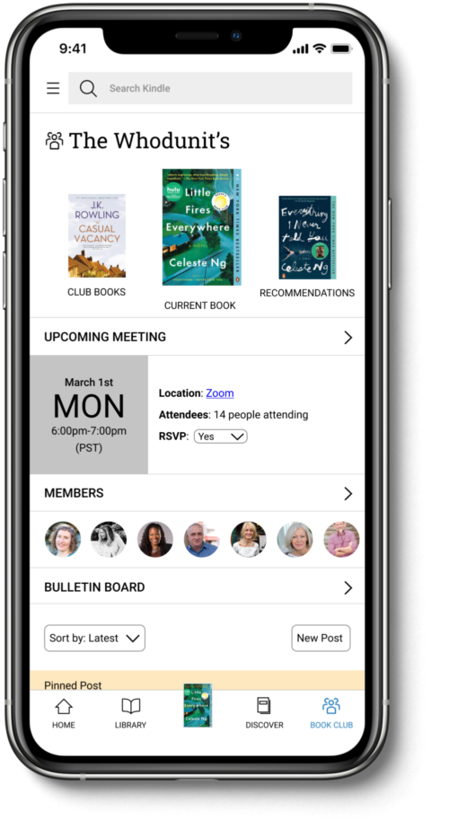
Kindle Book Club homepage
Since the primary screen navigation is already dedicated to getting around the Kindle App, we had to figure out a secondary navigation strategy. The books at the top of the homepage function like tabs to move between past, current and wish list books.
A popular reason for joining a reading group is the structure and accountability it creates. Displaying the details for the next meeting in a prominent position within the hierarchy will help users effortlessly keep track of their schedule.
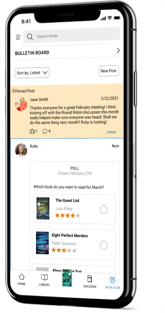
Since communication was one of the key themes in our user interviews, we made sure the Bulletin Board discussion space was part of the landing experience: banter with your book pals is just a quick scroll away!
Bulletin Board
Reading reminder
Prototype
User feedback and next steps
To understand where we would need to iterate to move our design from MVP to a full concept we asked test users to complete tasks in our prototype. From these tests, we assembled backlog takeaways for design and functionality.
Design
We received positive feedback from our users about how much our designs looked like the existing Kindle App. We followed the styles that we observed, however, some of those elements could be more user friendly, such as text size and hierarchy.

Navigation
Our test users were able to complete their tasks with minimal guidance. However, we observed a handful of navigation errors that we would prioritize to smooth out. We believe we could address most errors with better hierarchy.

Beyond MVP
Throughout the design process we brainstormed the variety of ways the Kindle App could fill the needs of book club groups. Not all of these fit within the MVP experience. We would look forward to building these out in future iterations!
