Kabuki Spa E-Commerce UX Update
The current product purchasing experience of Kabuki Springs and Spa falls short of the brand’s otherwise sophisticated image by sending the user to an outdated 3rd party shopping platform. For this design exercise at General Assembly, I explored how the shopper’s experience could be improved by integrating product purchases into the main site, modernizing key design elements and creating a more intuitive information architecture.
General Assembly
UX research & design
Sketch, InVision, Trello, Miro, Whimsical
3 week sprint
Analysis of current site
If a visit Kabuki Springs and Spa in-person melts away your cares and frustrations, an attempt to purchase one of the luxurious product you experienced at the spa risks doing the opposite. The current website puts unnecessary barriers between the customer and the products.

Barrier #1 | Buried Product Navigation
When you enter the Kabuki site, you’re asked to choose between “Springs” or “Spa,” with all other navigation hidden. If a user has come to the site specifically to buy a product, they may not realize that they can scroll to make the “Products” option appear in a top-level navigation bar.

From there, once the user selects “Products,” they won’t find any products on the site. They must click “Shop Now” to be taken to the 3rd party shopping site. In addition to adding steps to the navigation, using the 3rd party site means that there is no search bar option on the main site to help someone who knows what they want go directly to a favorite product.

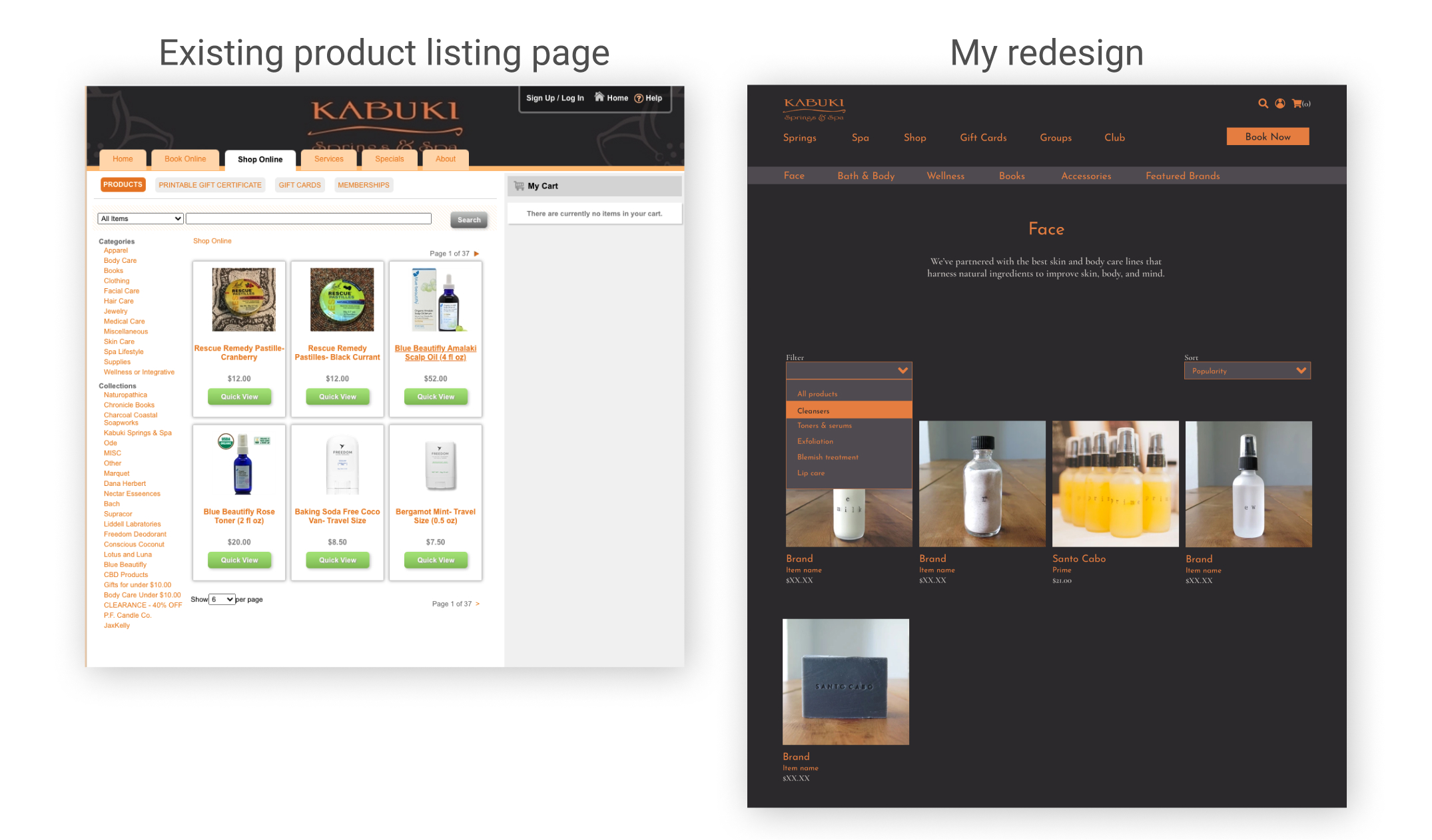
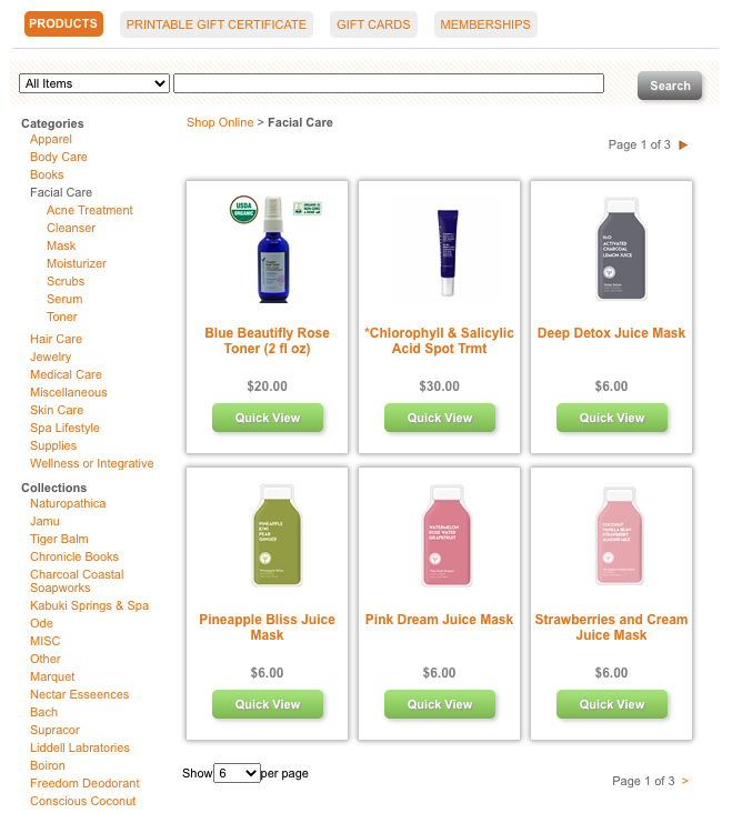
Barrier #2 | Overwhelming Information Architecture
Once on the Kabuki shopping site, the user is asked to navigate using a search bar, or to select from a product category or collection. The list of Categories and Collections is visually overwhelming. After browsing these categories and subcategories, I suspected that I could use research insights to improve on the information architecture.
Barrier #3 | Outdated Aesthetic
The sharp shadows, beveled buttons and interactions of the Kabuki shopping site reflect the design trends of an earlier era. While the site does enable a customer to successfully make purchases, the aesthetic-usability effect tells us that users will perceive an aesthetically pleasing site as more usable than one that doesn’t match their taste. I saw an opportunity to modernize the look of the Kabuki shopping site to improve the overall customer perception of the site.

Why purchase products from a day spa?
In preparation for the redesign work, I surveyed and interviewed users about their experiences purchasing products from day spas, as well as their needs when purchasing personal care products in general. Trust and an interest in shopping from a curated selection were key motivations behind users’ shopping behavior. From the survey and interview insights, I created user personas to help guide the site’s navigation. This data also lay the foundation for which information should be available on the product description page for each item.

PERSONA 1
Cass is a Kabuki Springs and Spa regular who wants to quickly find and checkout for her trusted personal care items.

PERSONA 2
Gina had a great experience at Kabuki Spa and is interested in their products because she gets overwhelmed by all the options on big box e-commerce sites and wants to shop from a curated selection she can trust.
Optimizing for E-Commerce
To improve the Kabuki Springs and Spa online shopping experience, I’d identified three key opportunities: navigation, information architecture, and visual design. For each of these categories, I moved forward with a research based approach.
Persona Inspired Navigation
To develop the purchasing navigation for the redesigned site, I considered how my two personas would shop. I created two task flows: one for the returning customer who would use the search bar to find a favorite product, and one for a new customer who wants to browse and explore before making a decision. These task flows also considered the difference between the signed-in and guest checkout experiences.

Card Sort Informed Information Architecture
While I suspected that the products on the site could be more intuitively organized, the only way to know that for sure would be to understand how users would group items themselves. To gather data on intuitive categorization, I used Trello to list a sampling of products from the site and asked users to group the items and create categories for their groups in a classic card sort activity. Based on the card sort results, I then created a new site map with the new categories (highlighted in red below).

Modernized Design
To understand current standards and trends for e-commerce sites, I researched best-in-class websites in both the spa space and e-commerce in general. I then adopted the patterns and designs that seemed best suited for Kabuki shoppers. I thought the color scheme and typography of the current site still reflected the company’s brand effectively, so incorporated those into the new designs. I also found a selection of higher quality photos to include in the mock-ups that would suggest an overall modernized aesthetic.

Final Designs
I removed the Springs vs. Spa gateway to take the customer directly to a redesigned homepage with a navigation bar and search option. Returning customers can go straight to the product they want using search, while new customers can explore all of Kabuki’s offerings.
Homepage

To solve the challenge of a product category navigation within a site that already has top level navigation, I followed a model I found on lifestyle brand sites. The product navigation appears as a second line when the customer reaches the Shop page. If a customer wants to refine their options, there are filter and sort options. This is especially helpful to someone who is browsing and looking to understand the product offering.
Product Listing Page

The product description page is important for building trust with new visitors so I chose the information displayed here based on insights from my user interviews and surveys.
Product Description Page

The new cart can be accessed from an icon in the upper-right of the page. This design is unobtrusive, but still a common pattern. The cart can be managed as a pop-up or as it’s own page. It allows the user to edit their purchase decisions and anticipate their final charge.
Cart
