Finli Onboarding Design Overview
As a young startup, Finli needed to solve a variety of challenges to scale. One of these challenges was that clients struggled to complete the onboarding process without contacting customer success. During my contract with Finli, I drew from my own experience in customer service to work with their team on how best to help clients get value from the platform as quickly and effortlessly as possible.
UX Design Intern:
project planning, research, ideation, implementation.
Product Designer
COO
Lead Engineer
Product Manager
Figma, Userpilot, Notion, Miro
5 months
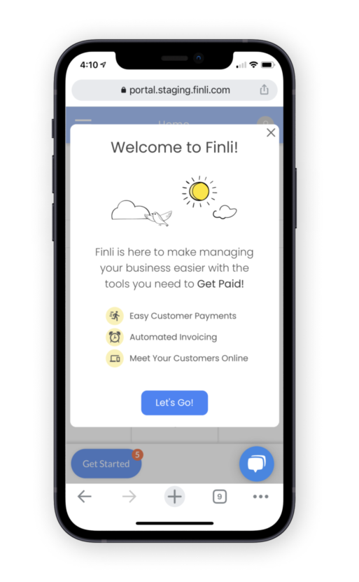
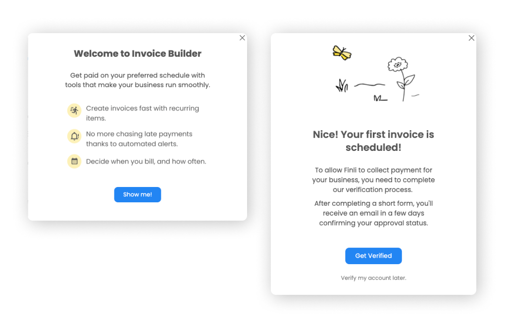
Finli’s mission and brand personality are reflected in this welcome modal from the redesigned onboarding experience.
Starting with trust
When joining a project as an outside team member, it’s important to build trust quickly. To build trust with my new team members at Finli, I listened to their expectations for the project phases, then put together a detailed project plan that reflected those expectations and demonstrated my approach to the design process.
I find the Stanford d.school five stages of Design Thinking to be a helpful framework when creating a design project roadmap. When I created my project plan, I adapted this methodology to the way that the Finli team members talked about the project.

Discovery
During the discovery phase, I focused my research on three areas:
I got to know the Finli platform through demos from team members and creating my own account. To understand the customer experience, I interviewed members of the sales and customer success teams and observed a new customer attempt to self-serve their onboarding.
I reviewed the onboarding experience of other SAAS companies to build my understanding of what a best-in-class onboarding could be like. In the ideation phase, I would draw from this comparative analysis for feature inspiration.
For this project, I wanted to become an expert on onboarding. To build my knowledge base, I explored articles about onboarding best practices and strategies. From this research, I took away key concepts like the “aha moment” and checklist psychology.
Who is the Finli client?
Finli uses a pair of user scenarios to describe their client base and understand their users’ needs. The onboarding project also worked with the assumption that a segment of clients would prefer a speedy, self-service account setup, instead of the current white-glove customer service onboarding.
USER SCENARIO 1
Wushu Karate is run by a husband and wife team. Their clients are parents and children who come to their studio or take virtual classes online. They need a way to make sure they can reliably be paid before the first of the month when they owe their rent and utility bills. Their business runs month to month without extra runway.
USER SCENARIO 2
Pacific Pets is a business where the owner also provides the service. They don’t have any employees and have less than twenty customers. They want to focus on providing great service and growing their business, not administrative tasks.
Audit
Now that I was familiar with the Finli platform and SAAS onboarding strategies, I applied those learnings to analyze the current client experience and pull together a recommendation for the Finli stakeholders. We used the client goal of collecting their first payment as the north star for our discussions.
Analyzing the current client experience
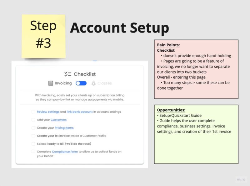
The Finli product designer and I walked through each existing onboarding step and listed the pain points and opportunities in a Miro board. We based the pain points and opportunities off of the research I’d collected in the Discovery phase. Our overall takeaway was that there wasn’t enough context around the onboarding steps and that some of the task flows weren’t intuitive.
Align stakeholders
Before moving into design work, it was important to get the Finli stakeholders aligned on a direction for the new onboarding strategy. Our stakeholders included the Founder and CEO, Customer Success, and Sales. To help this group understand the current customer experience, I walked them through a Journey Map I created. I built the Journey Map based on the data points I gathered in team member interviews and customer observation.
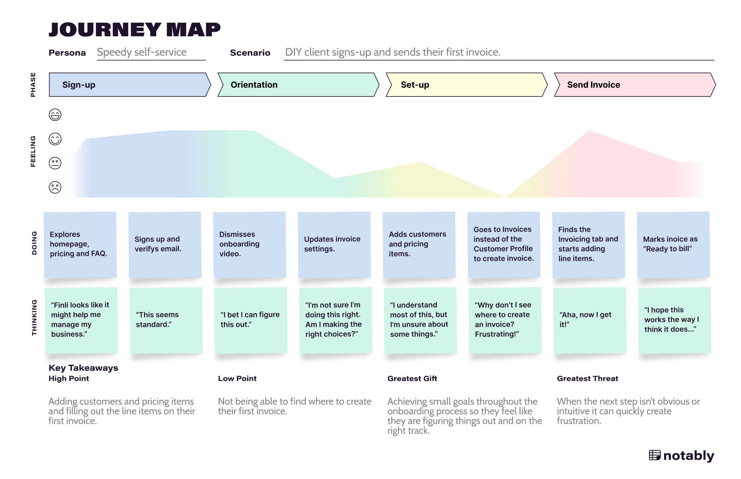
After the team had a chance to ask questions about the Journey Map and my research, I moved on to presenting my recommendations for how to address the onboarding pain points. I presented two design strategies with examples from other SAAS companies and the pros and cons of each one. After a discussion period, the stakeholder group and our project team decided on what I called the “Assisted” onboarding strategy. If you’d like to know more about the two strategies and how I communicated my research process, click here to view my presentation deck.
Ideation
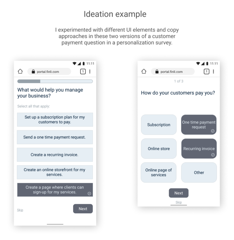
In the stakeholder meeting, the team had aligned on an “assisted” onboarding strategy. This strategy would add helpful guides on top of the existing Finli screens. I hopped into Figma to mock-up ideas for assisting clients with a personalization survey, a quick-start checklist, pop-ups and tool tips. The goal of my lo-fi and mid-fi wireframes was to show multiple approaches to these possible onboarding elements so that the team could then give feedback and we could work towards finalizing our approach.
Iterate and iterate some more
With my initial wireframe flows as a starting point, the Finli product designer and I then began several rounds of iteration with the Finli COO as a key partner and the Finli Founder and CEO as the primary stakeholder for feedback. Three key decisions came out of our iteration discussions:
The trickiest decision to make was which steps belonged in the quick-start checklist that new Finli clients would use for onboarding. The product designer and I got feedback on multiple flows and strategies before reaching a final list of necessary setup tasks.
During the iteration phase, we researched 3rd party platforms that could let us easily add onboarding features like a checklist and tool tips on top of the existing Finli screens. We landed on Userpilot as the service that would let us achieve a solution closest to our vision.
We cut the idea of an onboarding survey to personalize the experience because we weren’t able to achieve the level of personalization that we’d planned with a 3rd party solution. Without the personalization benefits, an onboarding survey would be unnecessary friction between the client and their goal of collecting their first payment.
Implement
To build and launch the new onboarding experience, the Finli product designer and I worked in two, three week sprint cycles with the Finli product manager and the project’s lead engineer. We focused on the desktop experience in the first sprint, and the mobile experience in the second sprint.
In the first week of each sprint, I built the onboarding UI in Userpilot on the Finli staging environment and wrote the accompanying copy. The second week was dedicated to feedback, iteration and the addition of custom code from the lead engineer. Finally, in the third week, the product manager led QA, we addressed any issues, and the experience launched onto the live site.
The final experience included three types of self-service assistance for the client:
Quick-start checklist
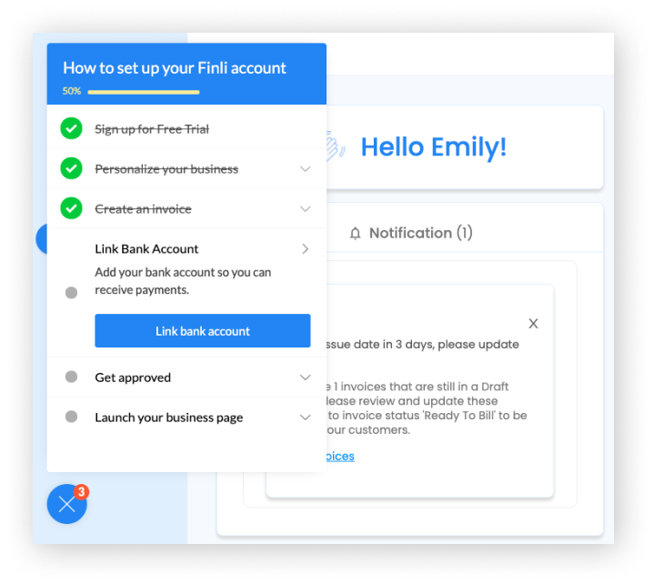
We replaced the old, static, Finli onboarding checklist with a dynamic checklist built in Userpilot. This checklist improved on the old one in the following ways:
- Interactive: When the client clicks on the call to action in a step, it takes them directly to the relevant screen, which may also launch a tool tip tutorial to keep the user moving through the process.
- Smart: When the client completes an onboarding step, it’s automatically crossed off from both the desktop and mobile checklists.
- Contextual: each step has copy giving a clear reason for why it’s part of the onboarding process.
- Dismissible: if a client doesn’t want to use the checklist, they can close it by clicking the blue “X.” The client can easily reopen the checklist.
Tool tips
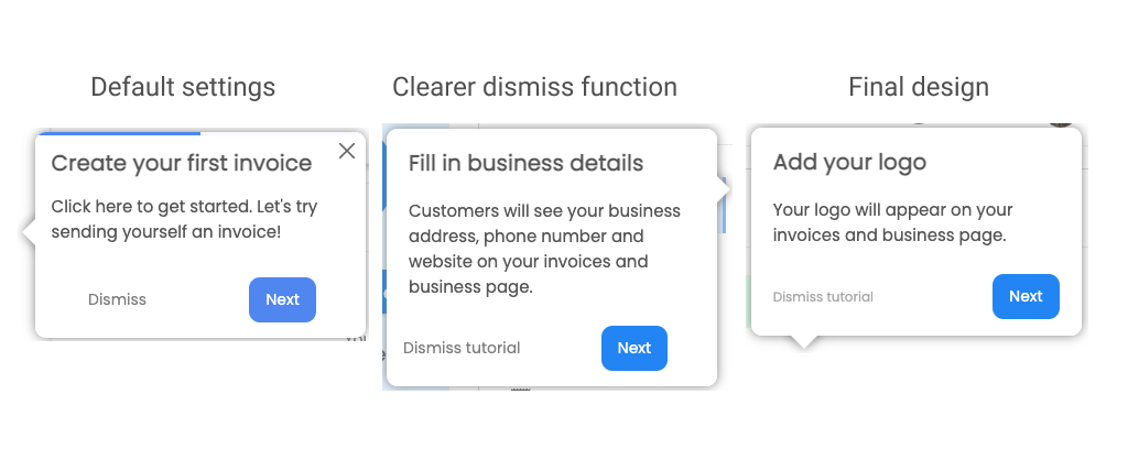
We added tool tip tutorials for multi-step onboarding processes. The tool tips offer step by step guidance for clients who want a little extra support during their setup. They can easily be dismissed if someone doesn’t need them.
While we built the tool tips with Userpilot, there were a number of design decisions that we made along the way. The below images show our iterations as we worked to make sure that it was clear how to dismiss the tutorial, while minimizing the chance of accidentally dismissing it.
Modals
We used modals (AKA pop-ups) strategically through the onboarding process. A modal could be used as a welcome screen to reinforce the value proposition of key Finli tools, or as a prompt to start a new onboarding step after a relevant action. The brand voice was especially important in these modals because the client would see them during key milestones in their onboarding.
Monitor
To understand whether the new onboarding assistance was helpful to clients, Finli would monitor data on the experiences in reports available in Userpilot. Before ending my contract, I reviewed the data and called attention to the most useful metrics such as percentage of users completing each onboarding step, and the exit rate for individual tooltips. As a small company, it would take at least a month or two to gather enough data for a confident evaluation. In the meantime, feedback from Sales and Customer Success could be a helpful way to understand client sentiment about the experience.
