Open Resume Catalog Overview
How do you use design to fix the altruism gap between what people say they would do and their actual behavior? This was one of the challenges our team faced when we joined the Open Resume Catalog project.
Nucleus
UX researcher, designer and writer.
Figma, Whimsical, Notion, Miro
3 week sprint
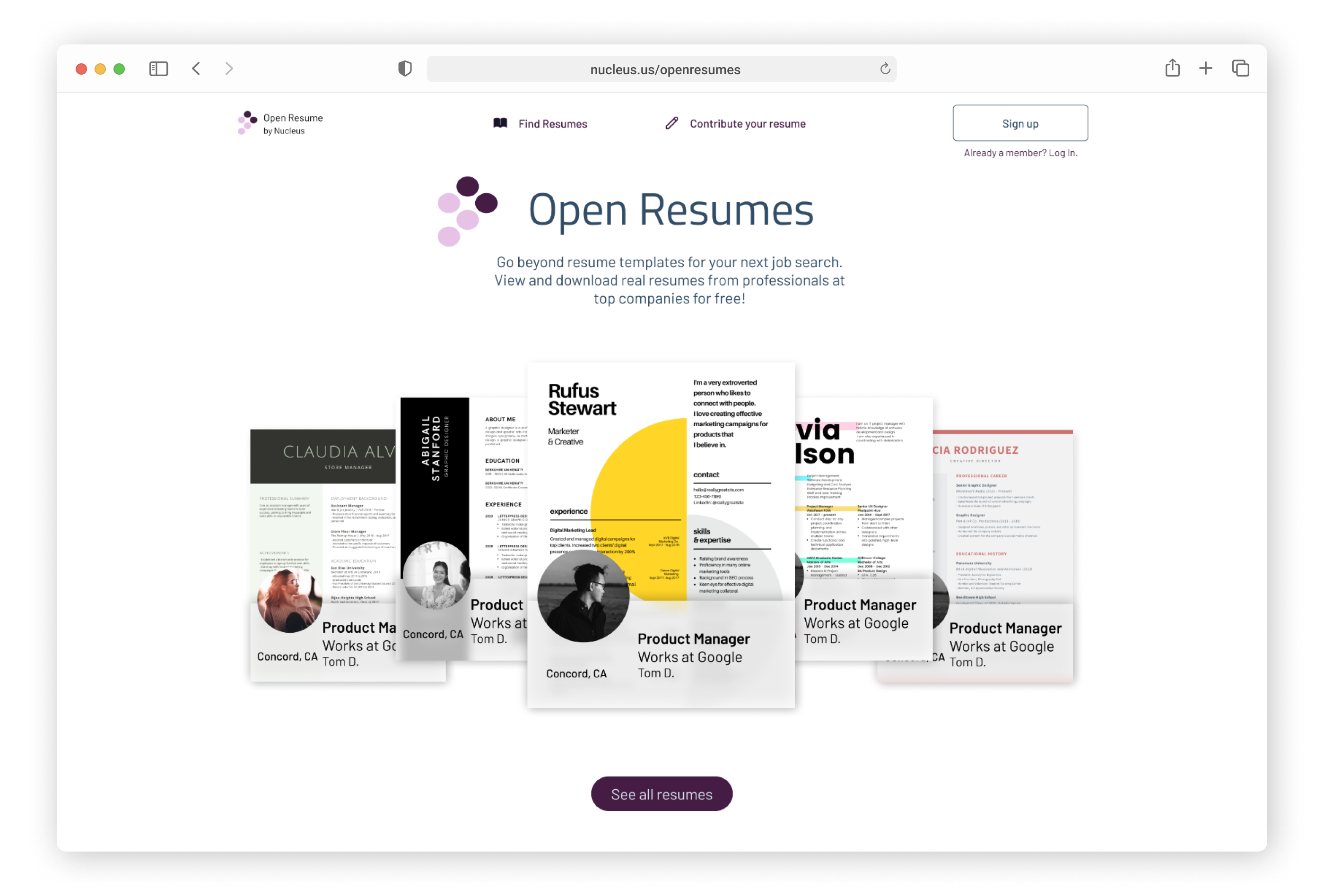
The Open Resume Catalog is a new concept from Nucleus, a resume management service. The Catalog will collect the real resumes of successful professionals and makes them available for job seekers to view for inspiration. Our design team worked directly with the founder of Nucleus to design responsive web pages for this new section of their site. Our final designs in Figma were development ready for building the MVP version and included final web copy.
Would professionals be willing to contribute their resumes?
We understood right away that the professionals contributing their resumes, the “Contributors,” were an important stakeholder alongside “Job Seekers.” On our team of three, my focus would be understanding and designing for Contributors. Our research survey included a section specifically for Contributors and we followed up on the survey findings with Contributor interviews. Here’s what we found:
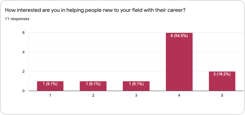
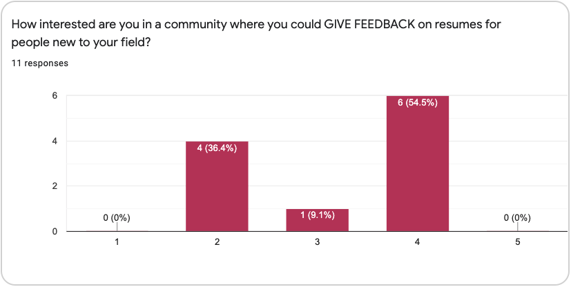
In general, professionals were interested in helping people new to their field.
In follow up interviews, these professionals reported that their desire to help came from empathy with job seekers. Additionally, those in technical and financial roles were interested in improving diversity in their field.
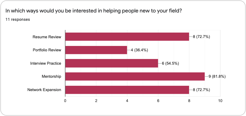
Professionals were open to a variety of activities, but few followed up on their interest with action.
Few of the professionals we interviewed had ever done any of the supportive activities we listed in the survey, even though they were interested in them. When we dug into the reasons for this, concerns about the time needed and emotional burnout were top of mind.
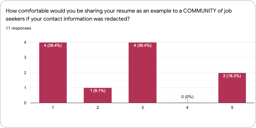
Professionals were hesitant about sharing their resume with a community.
When we explored this hesitancy in interviews, privacy and personal insecurities were the main reasons professionals were uncomfortable with the idea of posting their resume, even though all the information on the resume was already available in places like LinkedIn.
Professionals were more interested in giving resume feedback than sharing their own resume.
Our team was inspired by this data and thought resume feedback would be an exciting value-add to the Open Resume Catalog. Our survey for Job Seekers showed that they were eager for feedback from more senior professionals in their field, but had a hard time getting it. Additionally, in our competitive research we didn’t find any other platform that was connecting established professionals with job seekers specifically for resume review.
Bringing our Contributors to life
To help our team stay focused on what we learned about potential Contributors from our research, we used a persona. This persona also took into account the target audience of technology company professionals that The Nucleus founder was interested in.

Defining Minimum Viable Product
Based on our research, our team was excited about including resume review in the Open Resume Catalog community. However, when we presented this idea to the Nucleus founder he reiterated that our design needed to represent the MVP version of the catalog: what was the most basic thing he could build to demonstrate the proof of concept? Creating a way for site members to communicate in the Open Resume Catalog would add the need for community moderation as well as increase the technical lift.
MSCW Inventory
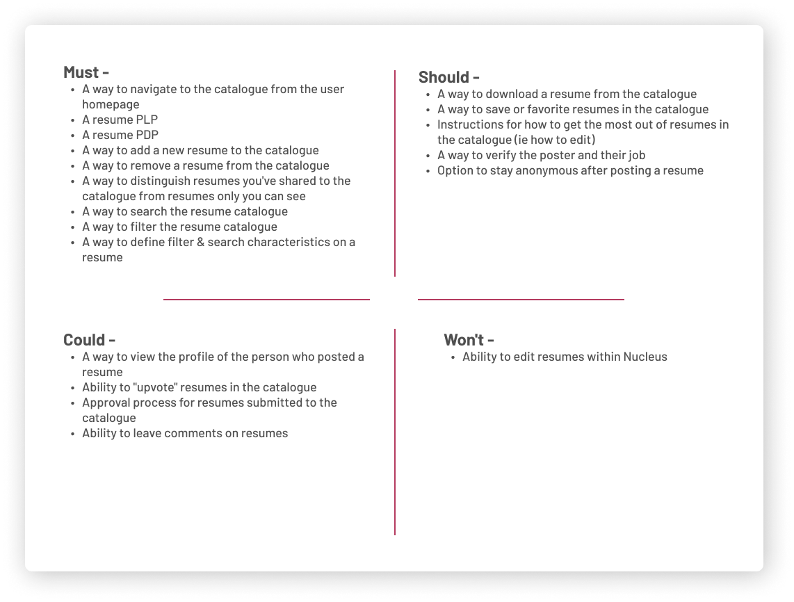
To get aligned on MVP requirements, we collaborated with the Nucleus founder on a MSCW inventory to define which features were essential, and which could be incorporated in future iterations. Resume feedback would be something we “could” do in the future, but wasn’t a “must” or “should” for MVP.
Itemizing the Contributor flow
As a team, we brainstormed the steps Contributors would need to take to upload their resume. Based on these steps, I laid out a task flow that would put each step on a separate screen so that the user would only need to focus on one task at a time and wouldn’t get overwhelmed by a screen with multiple tasks. We then incorporated the Contributor’s task flow into the overall user flow for the site.
User Flow
Contributor flow in red.

An experience with copy and design working together
The copy used in the Contributor Onboarding flow was an important part of the design. The Nucleus team wanted the Open Resume Catalog to have a clean, simple aesthetic, inspired by tools like the workspace platform Notion. A minimalist design would mean that any copy on a page would be the main focus of the user’s attention. Additionally, our deliverables needed to be development ready, so we wanted to make sure that the copy was high quality enough to go straight to the site.
Copy Writing Style Guide
Before starting design work, I created a copywriting guide for Nucleus that we then refined as a team. The copywriting guide captured the brand voice and tone as well as defined key brand terms.
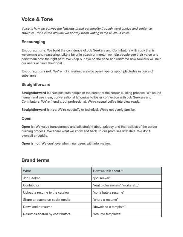
The copywriting guidelines come to life in my mobile landing page design.

Onboarding Flow For Contributors
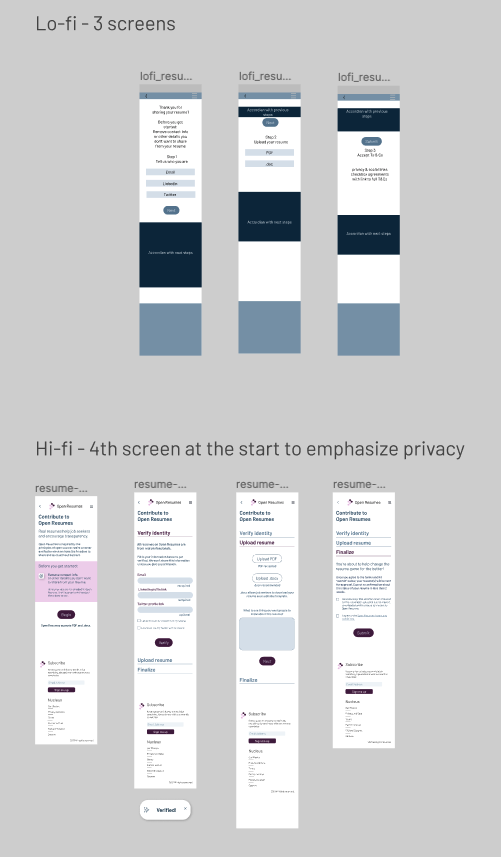
Starting in lof-fi mobile, then moving onto mid-fi mobile and desktop, I laid out the design of the Contributor onboarding flow. During this process, I separated the “edit resume” and “verify identity” steps into separate screens to make sure that the importance of pre-editing the resume to remove personal information was clear. The mid-fi version included the full proposed copy, which, after getting feedback, then made the process of moving to hi-fi a breeze!
Copy Highlights
Based on the motivations and concerns of our Contributors, I wrote copy for the resume upload flow that would:
- Encourage Contributors that they were doing something good and helpful.
- Reassure Contributors that they had control over the information they shared.
- Help Contributors easily understand what they needed to do in each step of the upload process.
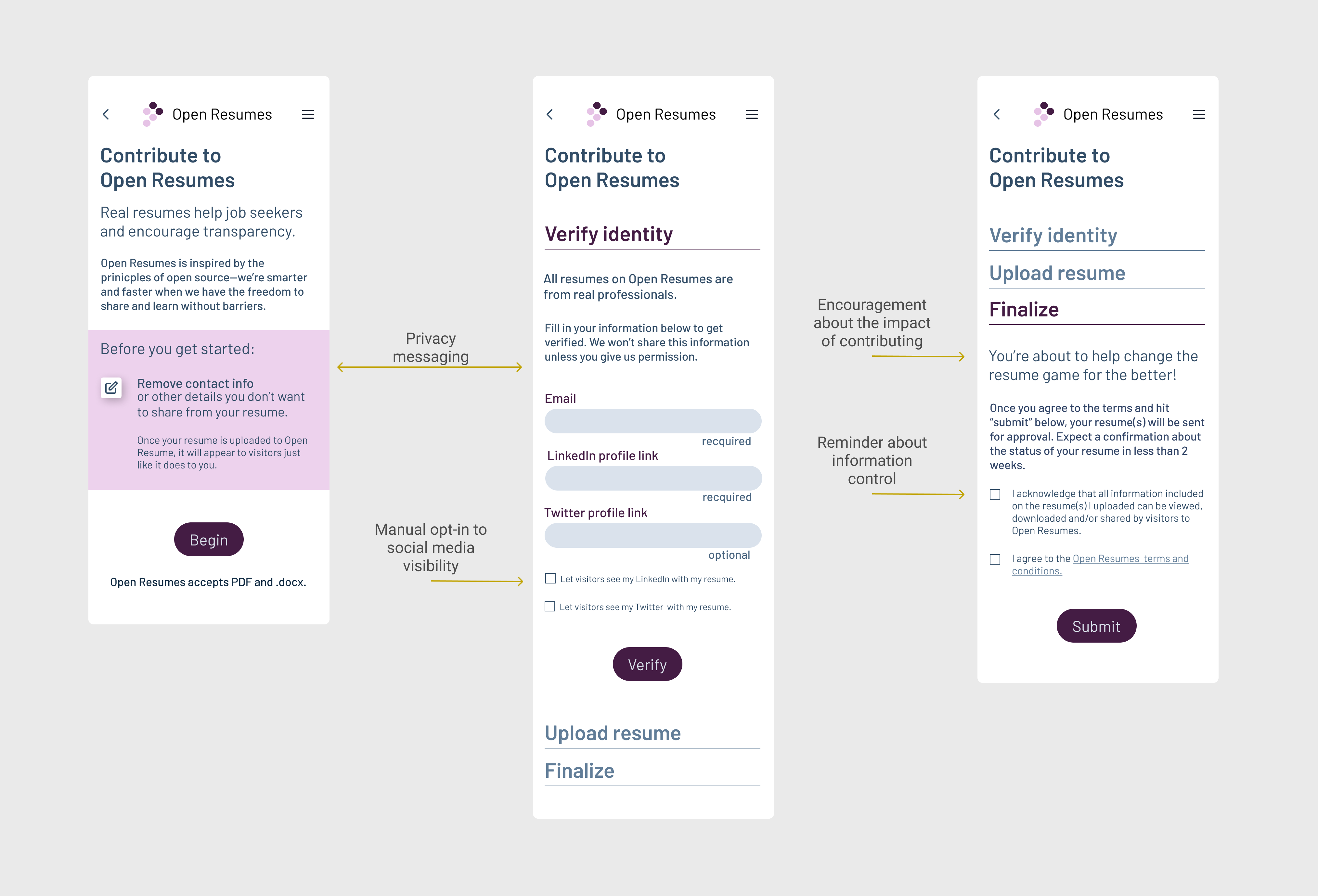
Building Contributor Confidence
After getting stakeholder feedback, it became clear that in addition to the steps for contributing a resume, that we would need a Contributor specific landing page to clarify the value proposition of sharing a resume and build trust. This FAQ-like landing page addresses the privacy and information control concerns that surfaced during our research. The landing page also encourages Contributors to sign up by reinforcing altruistic motivations.
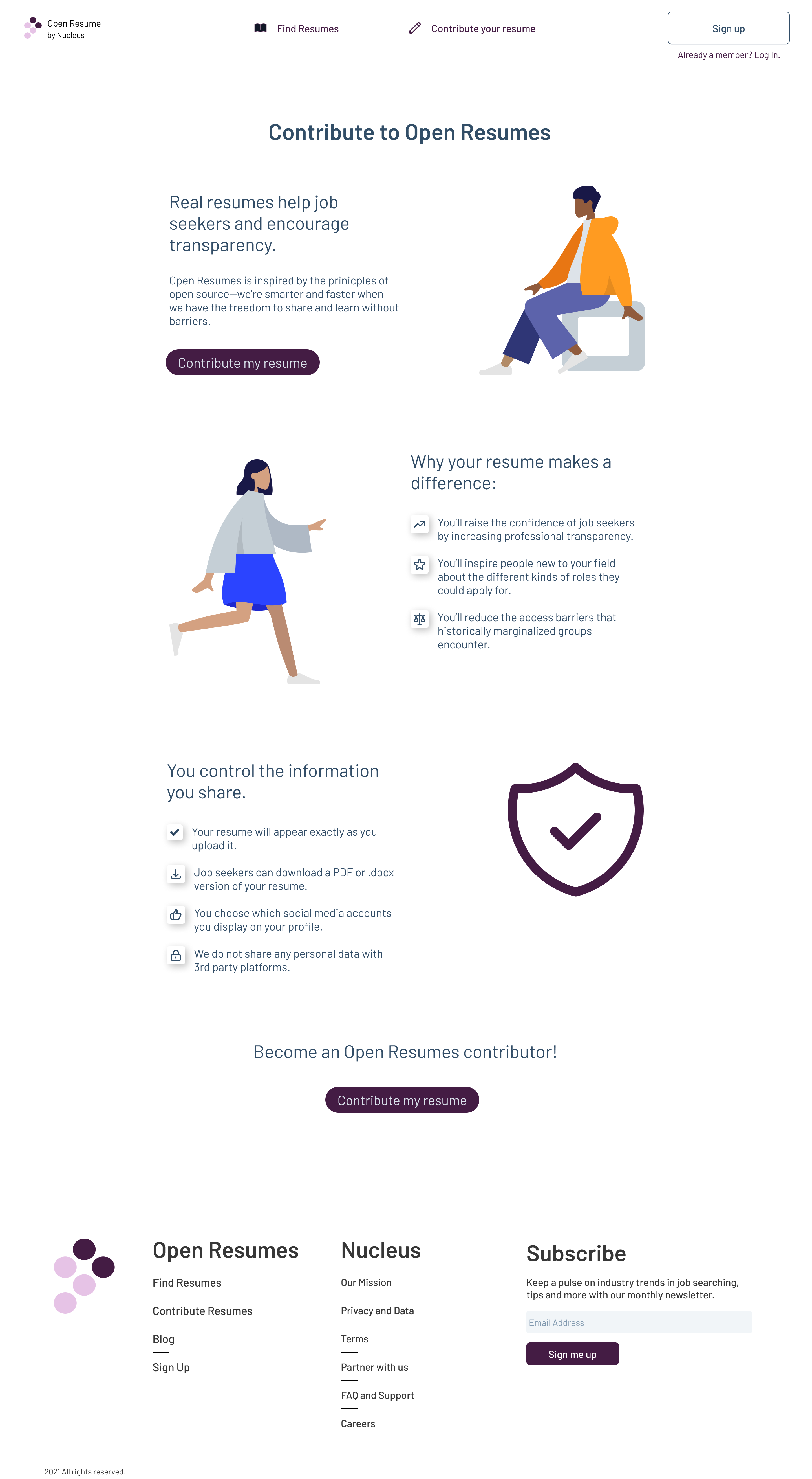
Final prototype
Nucleus and Open Resume Catalog work to help job seekers within the current, resume based, structure of the job search. Besides getting user feedback on our prototype, we had a consultation session with one of the Nucleus advisors, Chris Messina, a product designer best known for creating the hash-tag feature of Twitter. In this conversation, Chris encouraged us to think on a bigger scale: the resume isn’t the problem, but the job search as a whole. We don’t yet have a way to effectively connect the right people with the right roles, mainly because our storytelling tools are inadequate. How could something we create shift the industry to a new model entirely? While a three week sprint is a short time to solve all the problems of the job search, our designs were well-received by the Nucleus founder and would enable him to start building the product that he envisioned.
Prototype
