Wondernauts Overview
NASA Jet Propulsion Laboratory (JPL) needs innovative ways to inspire kids about space science because there is a lot of competition for the time and attention of young students. I teamed up with a partner for a Creative Jam hosted by Adobe and the NASA JPL ambassador program to design a tablet app prototype in Adobe XD that would address this challenge for middle school aged students. Our concept uses animation, bright colors and social interaction to get this age group excited about space science.
Adobe + NASA JPL
UX and Interaction Design
Ivan Huynh
1 week sprint, 2021
Form inspires function
We decided early in our brainstorming process that we wanted to create a collaborative game. However, neither of us had designed a game before. I felt like knowing what the game would look like would help us decide how players would interact with the game.
Style inspiration
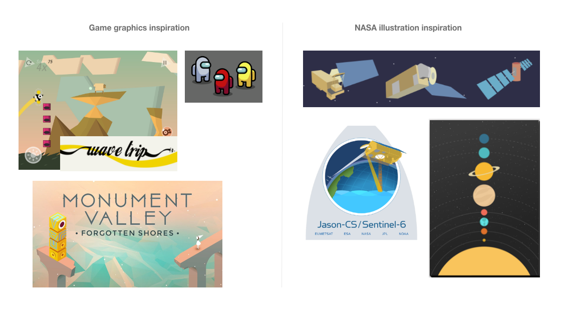
To avoid running into an issue of conflicting graphics styles I was interested in what we could create ourselves using the XD vector tools. I looked for inspiration in flat game design and NASA JPL illustrations.

Palette exploration
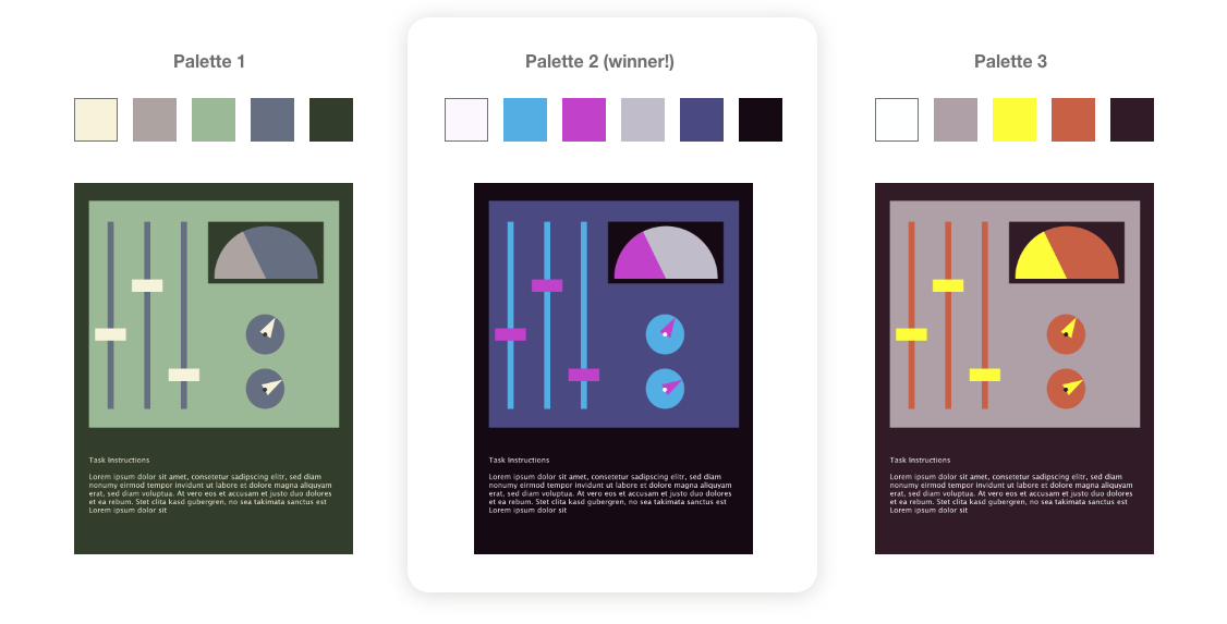
Inspired by the games and illustrations I found, I created a few possible color palettes that would go with a simple illustration style. We chose the middle palette since it had the highest contrast and best spoke to the space theme. I considered accessibility standards for all the palettes.

Understanding the audience
To learn about the middle school age group, I interviewed a science educator who has taught and designed curriculum aids for that age group. The key takeaways from the interview were that these kids are motivated by curiosity and the opportunity for social time with their friends, but often constrained from showing enthusiasm for learning by their social group. Since screen time may be limited by kids’ parents, having an educational game that parents approved of, but that gave kids a chance to be social would be appealing. This reinforced our direction that live collaboration should be a central part of the game.

Laying out the flow
Knowing we had 10 or more screens to work with, my partner and I started laying out how we could best communicate our idea in a prototype. We landed on featuring the experience of entering the game, 2 mini games, and an achievement summary screen. Homing in on the user flow helped us balance the 1 week timeline and the possibilities of Adobe XD with the game play concepts we imagined.

Interactions
To capture the attention of our young learner audience (and the Creative Jam judges) we identified the places where we could use animation and interactivity to bring our concept to life. Prototyping animations in XD was a new skill for me and I found it rewarding to explore the possibilities!


Final prototype
It can be challenging to distill grandiose game concepts into a simple, UX prototype. By starting with a set of constraints we were able to bring an example of collaborative game play to life.
Game play overview:
- When a player joins a game with their friends they are assigned a mission and brought to the waiting room. While waiting they should read the Mission Brief to get familiar with the game ahead and learn about the real-life NASA JPL mission that they’ll be re-enacting.
- Missions are divided into phases of play, and individual tasks within a phase are assigned to each player. The players must communicate in real time to do their tasks either sequentially or simultaneously.
- At the end of the Mission, the achievement screen summarizes the scientific accomplishments of the NASA JPL mission that the players just experienced.
